 |
ROLEXROLEXROLEXROLEXROLEXROLEX
 ROLEXROLEXROLEXROLEXROLEXROLEX
|
|
|
|
#1 |
|
Member
Join Date: Mar 2014
Real Name: Hannibal
Location: MA
Watch: Daytona, BLNR
Posts: 20
|
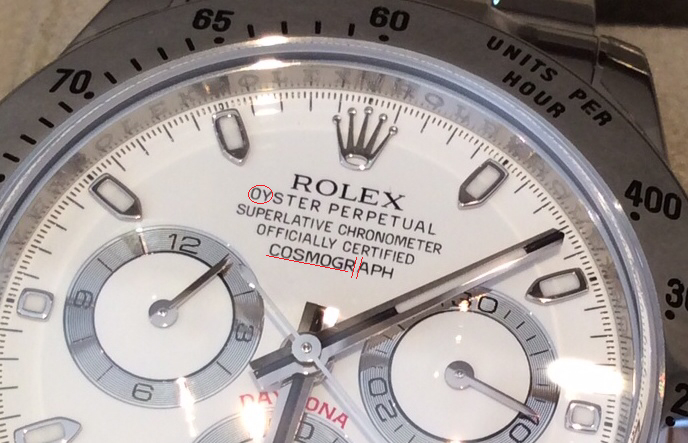
My new Daytona look a bit odd. Please help.
Hey guys, I got my white dial Daytona yesterday
 . And something just feel wrong about it. . And something just feel wrong about it. I got both Daytona this year from 2 different ADs, one in March, 2014 (black dial) and one yesterday (white dial).  . However, I feel that my white dial is a bit off and may not be authentic . However, I feel that my white dial is a bit off and may not be authentic  . You can see in the picture, the font of the words "OYSTER PERPETUAL" and "COSMOGRAPH" on the white dial Daytona look more sharp and thinner compare to the black dial Daytona which is more rounded and fat. Also, there are very tiny spaces between the word COSMOGRAPH on the black dial compare to no spaces on the white dial Daytona. I also feel the pusher on the white dial is a bit loose when you unscrew it to start the chrono and it doesn't feel smooth. . You can see in the picture, the font of the words "OYSTER PERPETUAL" and "COSMOGRAPH" on the white dial Daytona look more sharp and thinner compare to the black dial Daytona which is more rounded and fat. Also, there are very tiny spaces between the word COSMOGRAPH on the black dial compare to no spaces on the white dial Daytona. I also feel the pusher on the white dial is a bit loose when you unscrew it to start the chrono and it doesn't feel smooth.On the other hand, the booklet in the box I received with my white dial Daytona is not the right one, instead, it is the booklet for the Yatch Master. I am very confused. Can you guys show me your white dial Daytona with focus on the font so I can compare? Thank you very much for your help. 
|
|
|

|
|
|
#2 |
|
2024 SubLV41 Pledge Member
Join Date: Nov 2006
Real Name: Eddie
Location: Australia
Watch: A few.
Posts: 37,533
|
If you bought it from a Rolex AD it will be authentic.
__________________
E 
|
|
|

|
|
|
#3 |
|
"TRF" Member
Join Date: Jan 2013
Location: United States
Posts: 8,615
|
|
|
|

|
|
|
#4 |
|
"TRF" Member
Join Date: Apr 2007
Real Name: Bo
Location: Denmark
Watch: Rolex, of course!
Posts: 22,436
|
Well, you got both Daytona's from an authorized dealer... so one thing you can be sure of is that both are genuine.
Dial variations on Rolex dials aren't uncommon... so just SMILE enjoy both Rolex watches!
__________________
With kind regards, Bo LocTite 221: The Taming Of The Screw... |
|
|

|
|
|
#5 |
|
"TRF" Member
Join Date: Sep 2008
Real Name: Brett
Location: Bahrain, Dubai
Watch: Rolex and AP
Posts: 5,538
|
|
|
|

|
|
|
#6 |
|
2024 SubLV41 Pledge Member
Join Date: Mar 2010
Location: Paris, France
Posts: 35,300
|
there's a recent thread with someone else that had a similar printing "issue" with a new white dial daytona. so, it's not just you, if that's worth anything. if it bothers you, i would push for a dial replacement.

|
|
|

|
|
|
#7 |
|
"TRF" Member
Join Date: Nov 2012
Location: Slovenia, EU
Watch: BLNR
Posts: 1,507
|
|
|
|

|
|
|
#8 | |
|
2024 SubLV41 Pledge Member
Join Date: Mar 2010
Location: Paris, France
Posts: 35,300
|
on the grounds of the customer is not happy with the poor quality spacing and the customer is always right. especially when it comes to a watch that costs over 10 grand.  whether it works is another story. i'm not saying this would be bother me, but, i do know that when something does bother me, i would need to do something about it. Quote:
here's the pic (thread: click here). what's not marked in red is how the spacing in "perpetual" seems wider than the spacing in "oyster", which is just to the right. 
|
|
|
|

|
|
|
#9 |
|
"TRF" Member
Join Date: Jan 2011
Real Name: David
Location: australia
Posts: 20,216
|
Ad =100% genuine. Just dial variation. Get them to send you the right booklet and enjoy the watch.
Sent from my iPad using Tapatalk
__________________
watches many |
|
|

|
|
|
#10 |
|
"TRF" Member
Join Date: Apr 2014
Location: Los Angeles
Posts: 186
|
I am in the same predicament but with my two GMTs. Though I purchased mine pre-owned via TRF. The dial fonts have different weights: http://www.rolexforums.com/showthread.php?t=348812
Sent from my iPhone using Tapatalk |
|
|

|
|
|
#11 |
|
"TRF" Member
Join Date: Apr 2014
Location: Los Angeles
Posts: 186
|
Btw your post reminded me of another Daytona font spacing issue post I saw recently. I searched and found a different one (not the one I originally had in mind, which goes to show you're not alone): http://www.rolexforums.com/archive/i.../t-227218.html
Sent from my iPhone using Tapatalk |
|
|

|
|
|
#12 |
|
"TRF" Member
Join Date: Mar 2014
Location: NJ
Watch: 116610LN, 116234
Posts: 211
|
I think you should relax. It's your eyes playing tricks on you. Black on white background vs. white on black can give you this visual perception of a difference. Can happen even on paper let alone a smaller dial. You bought it from an AD. End of story, relax and enjoy your watch!!! Misplacing booklets is not uncommon in ADs especially since these don't have customer or watch particulars written on them. Just ask for a new one. You should receive one with an apology :)
__________________
116610LN, 116234 |
|
|

|
|
|
#13 |
|
"TRF" Member
Join Date: Jul 2012
Location: USA
Watch: SubC LV
Posts: 1,821
|
OCD. Chuckles
|
|
|

|
|
|
#14 |
|
"TRF" Member
Join Date: Apr 2014
Location: Los Angeles
Posts: 186
|
Still cannot find the thread where the guy posted very detailed photos and highlighted in red the font spacing issues on his Daytona.
Some more, however: http://www.rolexforums.com/showthread.php?t=59136 http://www.rolexforums.com/showthread.php?t=227218 http://www.rolexforums.com/showthread.php?t=150925 https://www.rolexforums.com/showthread.php?t=339411 Sleep easy buddy! Sent from my iPhone using Tapatalk |
|
|

|
|
|
#15 |
|
"TRF" Member
Join Date: May 2013
Location: Switzerland
Watch: 1665 GreatWhite SD
Posts: 1,527
|
I don't want to alarm you but your bezel is not 100% in right position or maybe the black face daytona is the one that's wrong lol relax if from AD your good
|
|
|

|
|
|
#16 |
|
"TRF" Member
Join Date: Mar 2014
Location: NYC / Milan
Watch: 6263
Posts: 3,938
|
yep, just the well documented differences between the "single tick" and "double tick" dials. nothing to worry about.
|
|
|

|
|
|
#17 |
|
"TRF" Member
Join Date: May 2007
Location: .
Posts: 17,898
|
Crown looks a little off as well
 Now go enjoy it! |
|
|

|
|
|
#18 |
|
"TRF" Member
Join Date: Jun 2009
Real Name: Adam
Location: Orlando, Florida
Watch: Me
Posts: 9,935
|
If it is from an AD you have absolutely nothing to be concerned with... Different variations of font and dials and as mentioned this is quite common with Rolex. Enjoy your new watch it is a beauty

__________________
The richest people in the world look for and build NETWORKS, Everyone else looks for work... Robert Kiyosaki |
|
|

|
|
|
#19 | |
|
"TRF" Member
Join Date: Jun 2009
Real Name: Brian
Location: Northern Virginia
Watch: One of Not Many
Posts: 17,892
|
Quote:

__________________
IWC Portugieser 7 Day, Omega Seamaster SMP300m, Vacheron Constantin Traditionnelle Complete Calendar, Glashutte PanoInverse, Glashutte SeaQ Panorama Date, Omega Aqua Terra 150, Omega CK 859, Omega Speedmaster 3861 Moonwatch, Breitling Superocean Steelfish, JLC Atmos Transparent Clock |
|
|
|

|
|
|
#20 |
|
"TRF" Member
Join Date: Aug 2010
Real Name: Alex
Location: England (andover)
Watch: Submariners all
Posts: 470
|
Some of these fakes are very good

|
|
|

|
|
|
#21 |
|
Banned
Join Date: Nov 2010
Location: Kingstown
Posts: 58,279
|
|
|
|

|
|
|
#22 |
|
"TRF" Member
Join Date: Oct 2011
Location: Brazil
Posts: 554
|
|
|
|

|
|
|
#23 |
|
2024 Pledge Member
Join Date: Oct 2009
Location: USA & France
Posts: 11,078
|
Looks good to me. Ask the AD for the correct box/paper work. Then enjoy the white dial Daytona - I personally cannot tell time very well on the black one.
|
|
|

|
|
|
#24 |
|
Banned
Join Date: Nov 2010
Location: Kingstown
Posts: 58,279
|
I think you should return it to the AD and ask for a "real" one.
It's terrible how they tried to pull a fast one on you. |
|
|

|
|
|
#25 |
|
"TRF" Member
Join Date: Sep 2012
Location: GMT -5
Watch: HulkPepsiCoke
Posts: 2,364
|
If you bought it from an AD, I wouldn't worry.

__________________

|
|
|

|
|
|
#26 |
|
2024 Pledge Member
Join Date: Feb 2010
Real Name: Neil
Location: UK
Watch: ing ships roll in
Posts: 59,369
|
The OY S TER looks really bad, I would return it.
|
|
|

|
|
|
#27 |
|
"TRF" Member
Join Date: Mar 2014
Location: NYC / Milan
Watch: 6263
Posts: 3,938
|
Interesting to see the reactions here. I had a choice between dials and chose the one that the OP is unsure about. I prefer the slightly more austere font and the less shiny subdials. Each to their own, of course, particularly when spending this sort of money on a watch.
For whatever it's worth, here is a summary of the differences between the dials that Rolex currently uses for the 116520: "Double tick dial" --- long second markers at the 27 and 33 marks --- slightly more stylized font for the wording up top, with even spacing between letters --- shinier sub-dials --- bolder font for the numbers within the sub-dials "Single tick dial" --- no long markers at the 27 and 33 marks --- slightly more austere font up top --- looks a bit more like "0YSTER" than "OYSTER" and a little like "COSMOGR APH" but not quite that extreme --- less shiny sub-dials --- plainer font within the sub-dials |
|
|

|
|
|
#28 | |
|
"TRF" Member
Join Date: Nov 2008
Real Name: Martin
Location: CA
Posts: 380
|
Quote:
I haven't realized that my Daytona is also COSMOGR APH 
|
|
|
|

|
|
|
#29 | |
|
"TRF" Member
Join Date: Oct 2010
Real Name: dp
Location: chicago, usa
Watch: panerai
Posts: 2,369
|
Quote:
__________________
dp just living the dream chicago, usa chgo_risti on IG |
|
|
|

|
|
|
#30 |
|
"TRF" Member
Join Date: Mar 2014
Location: NYC / Milan
Watch: 6263
Posts: 3,938
|
There are a number of threads on the forum that talk about the issue but I think this is probably the clearest:
http://www.rolexforums.com/showthread.php?t=150925 |
|
|

|
 |
| Currently Active Users Viewing This Thread: 1 (0 members and 1 guests) | |
| Thread Tools | |
| Display Modes | |
|
|
*Banners
Of The Month*
This space is provided to horological resources.