 |
ROLEXROLEXROLEXROLEXROLEXROLEX
 ROLEXROLEXROLEXROLEXROLEXROLEX
|
|
|
|
#1 |
|
"TRF" Member
Join Date: Apr 2021
Location: UK
Posts: 198
|
Better in photos vs better in real life
Just a bit of fun to see if you prefer a particular watch in person or in photos.
For me personally I always felt the Hulk looked amazing in photos but in the flesh the bezel was a little underwhelming with it's pastel colour (just my opinion - step away from the pitch forks). Conversely I own a Rootbeer and it's one of the most striking and aesthetically pleasing watches I own. I have tried multiple times to take a picture of it's beauty but it always looks a bit washed out. Just wondered if anyone else had these experiences? |
|
|

|
|
|
#2 |
|
"TRF" Member
Join Date: Jan 2019
Location: Uk
Posts: 1,039
|
White ceramic Daytona in real life. I saw it in Watchfinder was shocked when I saw it and tried it on. Not what I thought when looking at photos.
|
|
|

|
|
|
#3 |
|
"TRF" Member
Join Date: Aug 2018
Location: USA
Posts: 265
|
Exactly my impression as well. Don't get me wrong - great watch - but it did not leave much of an impression on the wrist. The black dial made a better impression on me and bought that instead
|
|
|

|
|
|
#4 |
|
"TRF" Member
Join Date: Nov 2018
Location: UK
Posts: 20
|
Agree with the two-tone Root Beer - it really does strike a completely different profile in the metal as opposed to in still images.
|
|
|

|
|
|
#5 |
|
"TRF" Member
Join Date: Nov 2020
Location: Europe
Posts: 821
|
I agree with the Two-tone Root Beer. It is SO much better in real life.
|
|
|

|
|
|
#6 |
|
"TRF" Member
Join Date: Jun 2020
Location: Australia
Watch: Various Rolex
Posts: 331
|
James Cameron

|
|
|

|
|
|
#7 |
|
"TRF" Member
Join Date: Oct 2019
Location: Bangkok
Watch: Explorer
Posts: 305
|
I would says for me it s Daytona 116520 black dial.
It look great in photos but even better in real. |
|
|

|
|
|
#8 |
|
"TRF" Member
Join Date: Feb 2008
Real Name: Juho
Location: Finland
Watch: Submariner 16610
Posts: 1,914
|
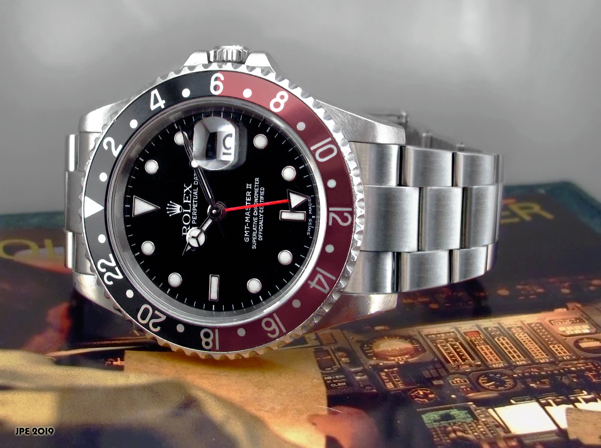
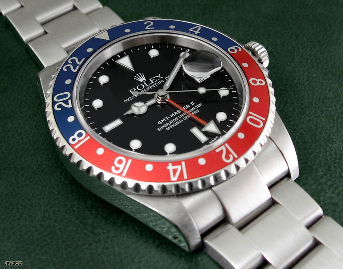
Kinda hate to say this as a longtime 16710 GMT owner... this is the most photogenic Rolex there is but on the wrist I have always preferred the 16610 black Submariner. It just looks better.
There, I said it. I still love my GMT though.  
__________________
My Luxury Watch Reviews Blog |
|
|

|
|
|
#9 | |
|
2024 Pledge Member
Join Date: Aug 2014
Real Name: Francisco
Location: San Juan, PR
Watch: Is Ticking !
Posts: 25,183
|
Quote:
Dont blame you!   Sent from my iPhone using Tapatalk Pro
__________________
Francisco ♛ 16610 / 116264 Ω 168.022 / 2535.80.00 / 310.30.42.50.01.002 / 210.90.42.20.01.001 Zenith 02.480.405 2FA security enabled |
|
|
|

|
|
|
#10 |
|
"TRF" Member
Join Date: Feb 2008
Real Name: Juho
Location: Finland
Watch: Submariner 16610
Posts: 1,914
|
Yes. After owning 15 Rolex watches I can safely say that black 16610 is simply perfection. There's no ifs and buts about this. It's the coolest of the cool.

__________________
My Luxury Watch Reviews Blog |
|
|

|
|
|
#11 | |
|
2024 SubLV41 Pledge Member
Join Date: Aug 2019
Location: New England
Posts: 1,933
|
Quote:
But for the sake of this thread, Ill go with the Everose YM, simply stunning in person and had to have one when I saw it! |
|
|
|

|
|
|
#12 |
|
"TRF" Member
Join Date: Feb 2013
Real Name: Flavio
Location: N/A
Posts: 14,654
|
|
|
|

|
|
|
#13 |
|
"TRF" Member
Join Date: Dec 2016
Location: Canada
Watch: Sub, GMT
Posts: 712
|
I agree. The crown is what gets me. It's not a difference between the ceramic sub vs gmt, but in the 5 digits the crwon on the sub is noticeably bigger, beefier, and more solid feeling than the equivalent GMT.
|
|
|

|
|
|
#14 |
|
2024 Pledge Member
Join Date: Apr 2018
Real Name: Harry
Location: England
Posts: 10,681
|
The 16 series Sub has a huge let down in the metal. It looked much nicer in photos. Of the watches now being built, I haven't yet met one that looked worse than in photos. Quite the opposite, although the Daytona is smaller than I perceived it to be from all the magazine ads and billboards pictures I see of it.
|
|
|

|
|
|
#15 |
|
"TRF" Member
Join Date: Apr 2017
Location: Midwest USA
Posts: 199
|
I recently saw a 42mm Yacht Master in white gold on Oysterflex. It was amazing in person and not large at all. In fact I had forgotten it was even made.
Great looking watch, frankly, the only issue I have with any Yacht Master name. Just never thought it was a good look to wear anything named "Yacht" |
|
|

|
|
|
#16 |
|
"TRF" Member
Join Date: Jan 2018
Location: Georgia
Posts: 6,309
|
BLRO. Looks amazing on other peoples wrists with the pics they post here. Didn’t look nearly as good on me when I tried it on.
|
|
|

|
|
|
#17 |
|
"TRF" Member
Join Date: Jan 2018
Location: PA USA
Watch: Explorers
Posts: 279
|
For me it was the Explorer 2 pre 2021 makeover. I loved the polar in photos and felt it would be my next purchase. When I tried it on at the AD I didnt love it as much as I had hoped. The black dial however didnt really feel special in photos but once handling it in person, and seeing the floating hands I made the purchase.
|
|
|

|
|
|
#18 |
|
Banned
Join Date: Dec 2020
Location: Tokyo
Posts: 969
|
|
|
|

|
|
|
#19 |
|
"TRF" Member
Join Date: Aug 2018
Location: HK
Posts: 4,366
|
BLNR gen one for me.
|
|
|

|
|
|
#20 |
|
2024 Pledge Member
Join Date: Oct 2009
Real Name: Gary
Location: USA
Watch: Daytona
Posts: 11,756
|
Bluesy Submariner in photos and in person. Cant take my eyes of it and it looks great in photos..imo...
 Sent from my iPad using Tapatalk
__________________

|
|
|

|
|
|
#21 |
|
"TRF" Member
Join Date: Jun 2015
Location: Toronto
Watch: 126710BLRO
Posts: 696
|
For me, every watch looks better in person except the BLNR. The BLNR photographs well but the blue is way too vibrant in person for me.
Another notable example for me is the BB58 blue. It looks kind of bland in pictures, but very nice in person. |
|
|

|
|
|
#22 | |
|
"TRF" Member
Join Date: Oct 2019
Location: Bangkok
Watch: Explorer
Posts: 305
|
Quote:
Totally agreed on both. Sent from my iPhone using Tapatalk
__________________
Explorer : 114270 & 124270, GMT Master II : 16710 BlackBay58 : 925 Silver Bullet Royal Oak : 34mm 77350st Nautilus : 3800/1a-012 & 7118/1a Blue dial A. Lange & Söhne : Little Lange 1 Grey Guilloché dial |
|
|
|

|
|
|
#23 |
|
"TRF" Member
Join Date: Jun 2011
Location: Texas
Posts: 4,913
|
I agree about the Hulk. The green bezel does look a bit washed out in certain lighting.
I have an AP 15300 with blue dial. I can never get a good pic of it; blue looks very flat and dull but in person it is very nice. |
|
|

|
|
|
#24 |
|
"TRF" Member
Join Date: Jan 2012
Real Name: Nakorelli
Location: Anytown, USA
Watch: Depends on the day
Posts: 368
|
Explorer 1 (blasphemy!)...but they make it look real nice in photos with the angles and everything. in real life...meh
__________________
Do you like having a good time? Then you need a good watch! |
|
|

|
|
|
#25 |
|
"TRF" Member
Join Date: Jun 2013
Real Name: Richard
Location: USA
Watch: me set the time
Posts: 2,520
|
For me watches with sunburst dials, breguets enamel work, any guilloche, fifty fathoms sapphire crystal bezel all look better in person.
On the other hand, plenty of hot watches look quite underwhelming when I tried them on in person. I would only pay MSRP and never the premium. |
|
|

|
|
|
#26 |
|
"TRF" Member
Join Date: Oct 2011
Location: USA
Posts: 241
|
Tudor BB58 Black; think it looks ok, at best, in photos but is stunning on the wrist. The rivets on the bracelet fade away and the rose gold on the dial/bezel pops just right. Chamfered edges are perfect and the angled brushed finishing looks great. All details that don't translate well in photos alone.
|
|
|

|
|
|
#27 |
|
"TRF" Member
Join Date: Mar 2020
Location: Midwest
Posts: 1,719
|
Any Daytona! Can't believe how difficult they are to read. How small the chrono dials are. Pictures are much better compared to in-person.
|
|
|

|
|
|
#28 |
|
"TRF" Member
Join Date: Apr 2021
Location: UK
Posts: 198
|
Daytona is a strange beast. Always looks amazing in photos but I whenever I have tried one on it always wears small. I swear it's an illusion. DSSD looks big in pics and wears big, although when I owned the JC I had the build to pull it off - (big guy in a Kevin James way not The Rock way :) ) but the Daytona seems like it fits perfect on everyone in photos and in real life just seems small. Maybe it's because my eyes focus on the sub dials vs the space of a sub dial if that makes sense?
|
|
|

|
|
|
#29 | |
|
"TRF" Member
Join Date: Nov 2020
Location: Europe
Posts: 821
|
Quote:
|
|
|
|

|
|
|
#30 |
|
"TRF" Member
Join Date: Aug 2015
Location: Houston
Watch: SkyD, SD43, GMT2
Posts: 5,061
|
BLNR, love it in pictures, didn't like it on my wrist.
Explorer, bores the hell out of me in pictures but love it in person. |
|
|

|
 |
| Currently Active Users Viewing This Thread: 1 (0 members and 1 guests) | |
| Thread Tools | |
| Display Modes | |
|
|
*Banners
Of The Month*
This space is provided to horological resources.