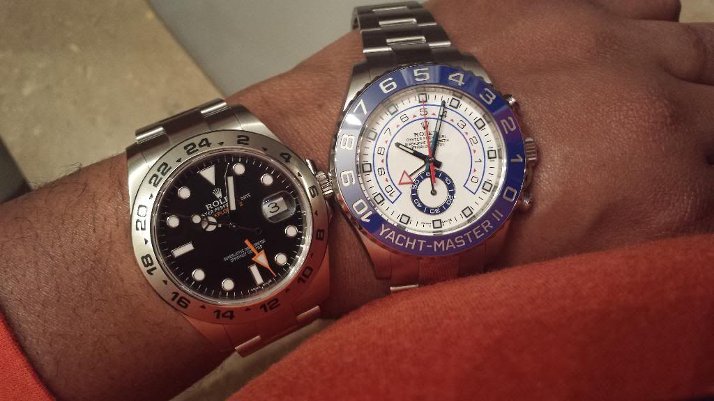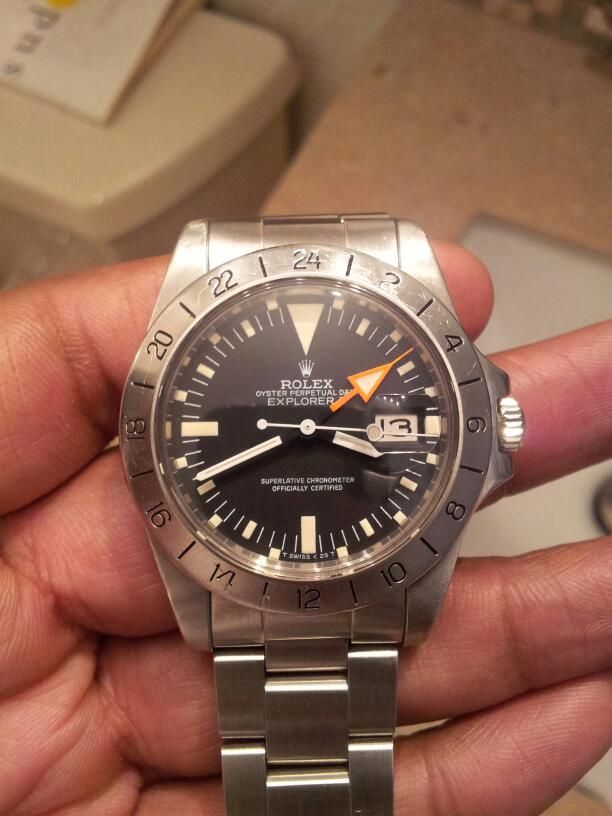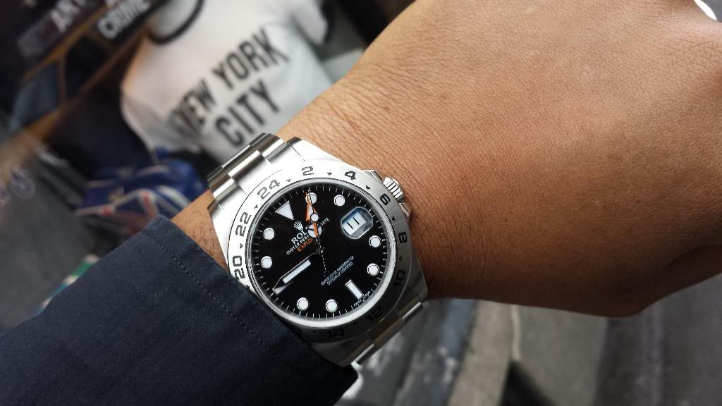
 |
ROLEXROLEXROLEXROLEXROLEXROLEX
 ROLEXROLEXROLEXROLEXROLEXROLEX
|
|
#31 |
|
"TRF" Member
Join Date: Feb 2011
Location: England
Watch: 16710, 16628
Posts: 7,757
|
At a guess I'd imagine it's to make the hands easier to distinguish when they overlap.

__________________
GMT II 16710 TRADITIONAL ( D- Serial #) ROLEXFANBOY P-Club Member #4 |
|
|

|
|
|
#32 |
|
"TRF" Member
Join Date: Apr 2012
Location: New Jersey
Posts: 4,224
|
Look if someone offered me the 1655, I'd take it in a second. I think the consensus is that the white dial Explorer II is now the popular favorite and really has been since the 1655 was discontinued. In many ways I think the explanation is simple, Submariners and GMT Masters (unless you have access to a really rare Pan Am corporate version) do not come in a white dial. If you want a white dial Rolex that's more sporty you're getting a Daytona or an Explorer II (yes I know the Milgauss and DJ come in white dials but I'm throwing them in the dressier category).
The hands on the black dial bother me and affected my decision to go with the white dial but the number one reason I got the white dial was because I already owned a Submariner. Also the Explorer II has been redirected as more of an outdoor, cold weather watch. The white dial seems to reflect that spirit a tad more. Just my opinion on why the white dial has become more popular. Before my black dial brothers get all up in arms, I have said over and over, if I were getting an Explorer II for my first Rolex, I would likely go with the black dial. It's a still a beauty in its own right. |
|
|

|
|
|
#33 | |
|
"TRF" Member
Join Date: May 2009
Real Name: Sam
Location: Gotham City
Watch: Wall Street
Posts: 9,954
|
Quote:
 After years of owning my 216570 I'm still very happy with my purchase!  I'm not typing what I really want to say, however, good luck with your choice!  
__________________
"Wealth is of the heart and mind, not of the pocket!" "A Watch Is An Emotional Object, And So, It Is The Responsibility Of The Brand To Create Emotion Through It's Products" - Georges Kern "In the 1950s and 60s, they made the Ref 8171, which is a cult collectiblenow thats the ultimate Rolex you could own with a calendar and a moon phase. - John Reardon "Heh, heh, heh..." - Michael Kilyung |
|
|
|

|
|
|
#34 | |
|
"TRF" Member
Join Date: Sep 2013
Location: Minneapolis, MN
Posts: 259
|
Quote:
And what, exactly, do you REALLY want to say but aren't saying? 
|
|
|
|

|
|
|
#35 |
|
"TRF" Member
Join Date: May 2009
Real Name: Sam
Location: Gotham City
Watch: Wall Street
Posts: 9,954
|
Taking a closer look at my 216570 I don't notice the unevenness you're mentioning. I personally feel the gloss works perfectly on it... Matte on the 1655 and gloss on the updated 216570 looks good to me.
__________________
"Wealth is of the heart and mind, not of the pocket!" "A Watch Is An Emotional Object, And So, It Is The Responsibility Of The Brand To Create Emotion Through It's Products" - Georges Kern "In the 1950s and 60s, they made the Ref 8171, which is a cult collectiblenow thats the ultimate Rolex you could own with a calendar and a moon phase. - John Reardon "Heh, heh, heh..." - Michael Kilyung |
|
|

|
|
|
#36 | |
|
"TRF" Member
Join Date: Sep 2013
Location: Minneapolis, MN
Posts: 259
|
Quote:
When I say unevenness, I mean the LENGTH of the black part of each hand is different on each hand (longest on the 24-hr hand, shortest on the hour hand). With the Freccione, there was the same LENGTH of black on each of the three hands, as you can see in your photos. Any thoughts on the question I'm asking, now that I've explained it better? |
|
|
|

|
|
|
#37 | |
|
"TRF" Member
Join Date: May 2009
Real Name: Sam
Location: Gotham City
Watch: Wall Street
Posts: 9,954
|
Quote:
Here are some parting pics, I have to be up at 4:30am    
__________________
"Wealth is of the heart and mind, not of the pocket!" "A Watch Is An Emotional Object, And So, It Is The Responsibility Of The Brand To Create Emotion Through It's Products" - Georges Kern "In the 1950s and 60s, they made the Ref 8171, which is a cult collectiblenow thats the ultimate Rolex you could own with a calendar and a moon phase. - John Reardon "Heh, heh, heh..." - Michael Kilyung |
|
|
|

|
|
|
#38 |
|
"TRF" Member
Join Date: Jul 2012
Location: USA
Watch: SubC LV
Posts: 1,821
|
|
|
|

|
|
|
#39 |
|
"TRF" Member
Join Date: Jul 2012
Location: USA
Watch: SubC LV
Posts: 1,821
|
I think the current exp would have been a home run if they used retro hands on the watch with nine glossy finish on them
|
|
|

|
|
|
#40 |
|
"TRF" Member
Join Date: Oct 2009
Real Name: Kenny
Location: northern ireland
Watch: SDs, Subs & GMTs
Posts: 5,136
|
The debate could go on forever here - in any event, both versions of the 42mm are very nice and as always, it comes down to personal preference. Super watch all in!
|
|
|

|
|
|
#41 |
|
"TRF" Member
Join Date: Jan 2009
Location: Dallas
Watch: 12800ft = 3900m
Posts: 11,173
|
This is the bad part about TRF, the indecision.....
Threads come up with little details and all the sudden you now see it too. Before I would walk into an AD and just pick what I like, now it's like an OJ Simpson trial trying to decide which one. I liked the black, then 100% white because the hands thing, now after Sam's classic pictures, the Polar's orange hand looks sterile and unfinished, never even considered this but now I kind of think the black makes more sense visually and historically. Just wish the paint matched the dial. |
|
|

|
|
|
#42 |
|
"TRF" Member
Join Date: May 2013
Location: Montreal, Canada
Posts: 92
|
All I know is that the dial/hand design works well for me! The watch is super easy to read, looks balanced and very swell, both in general appearance and in when looked at in detail.
It looks different in different kinds of light, and I woudn't judge the watch based on pictures only. Based on pictures, I thought I wanted a white-dial version, and as soon as I saw the watch in person, it became clear to me that they are two VERY different watches, intended for different purposes and tastes. The black looks 10 times better in the flesh than it does in pictures, is very versatile, and I keep thinking that the design is very well thought through. Super happy with mine! |
|
|

|
|
|
#43 | |
|
"TRF" Member
Join Date: Sep 2013
Location: Minneapolis, MN
Posts: 259
|
Quote:
It's a really, REALLY tough call between black and polar. It's not out of the realm of possibility that I would choose BOTH. Is that nuts? |
|
|
|

|
|
|
#44 |
|
"TRF" Member
Join Date: Dec 2013
Real Name: Drew
Location: PHILADELPHIA
Watch: CROWN MARKED
Posts: 2,158
|
Yes it's crazy. Pick the white dial and be done with it. Later on get this-
__________________
 "Raise your glass high, those here for those not with but a sigh; for enjoy each day, it comes but once, then quickly to the past as it must" - King Rolesar 03 "Raise your glass high, those here for those not with but a sigh; for enjoy each day, it comes but once, then quickly to the past as it must" - King Rolesar 03
|
|
|

|
|
|
#45 |
|
"TRF" Member
Join Date: Sep 2006
Location: Hong Kong
Watch: All of them
Posts: 2,789
|
There are bigger things in life to worry about then this.....assuming one has life
Buy what you like and move on.....
__________________
I used to be indecisive, now I'm not sure |
|
|

|
|
|
#46 |
|
"TRF" Member
Join Date: Jul 2010
Location: PNW
Watch: DS,BLNR,SubLV,DJ2
Posts: 8,123
|
I looked at both at an AD and in two minutes I knew the one with the polar dial was what I wanted. So clean, crisp, and easy on the eyes day or night.
|
|
|

|
|
|
#47 |
|
"TRF" Member
Join Date: May 2013
Location: Montreal, Canada
Posts: 92
|
In my opinion, the gloss black on the hands is to reflect the glossy finish of the rhodium plated gold hands. The matte black used in the earlier version was to fit with the matte white finish of the bâton hands.
Got my 216570 (black) back from RSC last week and I had forgotten how much I enjoy wearing that watch. It looks so good and is such a pleasure to wear! |
|
|

|
|
|
#48 | |
|
"TRF" Member
Join Date: Sep 2008
Real Name: Clive
Location: Exoplanet
Watch: spring-driven
Posts: 38,856
|
Quote:
It's worth mentioning again that the black dial of the 216570 is a satin finish (not a true matte) and appears brownish in certain light. I think this would look a bit odd for the base of the hands, and the glossier black finish works better overall with the hands. Btw, I believe the hands are white gold, at least according to the spec sheet I have (below)  . . . . OYSTER PERPETUAL EXPLORER II CASE Type: OYSTER (monobloc middle case, screw-down case back and winding crown) Diameter: 42 mm Material: 904L stainless steel superalloy, polished and satin finished Case back Screw-down with Rolex fluting Bezel: Fixed, 24-hour graduated, sun satin finished, polished bevelled edge Winding crown: Screw-down, TWINLOCK double waterproofness system Shoulders to protect the crown Crystal: Scratch-resistant sapphire CYCLOPS lens (2.5 ×) over the date, double anti-reflective coating Waterproofness 100 metres (330 feet) MOVEMENT Calibre 3187, Manufacture RolexPrecision Officially certified Swiss chronometer Functions: . 24-hour hand GMT with independent rapid-setting of the hour hand . Instantaneous date at 3 o’clock . Stop-seconds for precise time setting . Oscillator Frequency: 28,800 beats/hour (4 Hz) . Non-magnetic blue PARACHROM hairspring . Breguet overcoil . Large balance wheel with variable inertia . High-precision regulating via four gold MICROSTELL A nuts . Traversing (full) balance bridge . High-performance PARAFLEX shock absorbers . Jewelling 31 rubies . Winding Bidirectional self-winding via PERPETUAL rotor . Power reserve Approximately 48 hours DIALS - White lacquered CHROMALIGHT display with long-lasting luminescence Hands White gold, wide, hollowed, black lacquered Orange 24-hour hand - Black, satin finished CHROMALIGHT display with long-lasting luminescence Hands White gold, wide, hollowed, “phantom effect” (black base on black dial) Orange 24-hour hand, “phantom effect” (black base on black dial) Hour markers Highly legible white gold appliques BRACELET Type OYSTER, three-piece solid links Material 904L steel superalloy, satin finished, polished edge Clasp OYSTERLOCK folding clasp with safety catch EASYLINK 5 mm comfort extension link REFERENCE (CASE – BRACELET): 216570 – 77210
__________________

|
|
|
|

|
|
|
#49 | |
|
"TRF" Member
Join Date: Mar 2007
Location: Louisiana
Posts: 813
|
Quote:
__________________
GMT 1675 SS (1969) Tudor Big Block Chrono 79170 white-dial panda (~1993) Tudor Big Block Chrono 79180 black-dial panda (~1993) Tudor Sub 79090 (1992) |
|
|
|

|
 |
| Currently Active Users Viewing This Thread: 1 (0 members and 1 guests) | |
|
|
*Banners
Of The Month*
This space is provided to horological resources.