
 |
ROLEXROLEXROLEXROLEXROLEXROLEX
 ROLEXROLEXROLEXROLEXROLEXROLEX
|
|
#1 |
|
2024 Pledge Member
Join Date: Jul 2012
Location: VIE
Watch: my sig. ;)
Posts: 3,090
|
A few opening remarks...
1. Bronze alloys were introduced in horology (more specifically for sailing / diving models) mainly due to their characteristics and association with the sea. The patina created by the oxidation of the alloys is part of the charm. Therefore I decided to photograph the watch "as is", several weeks after it was purchased, without giving it a fresh clean. There are no scratch marks on the watch, just oxidation streaking caused by direct interaction (like winding, strap-changing, etc.) 2. The supplied fabric strap is just shy of 23mm and fits near-perfectly.. However... it's very soft and will compress in certain positions (blame gravity) so some of the photographs may mislead you into thinking it's not the correct width... but rest assured, it is! 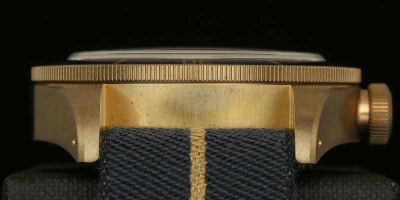 click-the-pics for hi-res goodness ~~~ Intro Ever since I decided my collection would center around "tool" watches and even more specific, diving watches, I had Tudor on my radar! My first tool watch was Mühle Glasshütte's S.A.R. Flieger Chronograph and my first diving watch was a Sea Dweller (16600). A few years later I added Omega's Seamaster 300 M.C. and very recently I had the real pleasure to add Seiko's "62MAS" Re-issue, the SLA017J/SBDX019! This "expedition" of mine started around the same time Tudor announced the very first Heritage Black Bay at Baselworld 2012... . 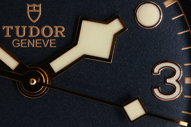 Heritage Black Bay (BB) 2012's Black Bay was the one to arouse my interest in Tudor and I would be remiss if I didn't admit that before that, I knew very little of Wildorf's "Montres Tudor S.A." I love to explore the history behind a watch I'm interested in and the Black Bay was no exception. The resources for learning about Rolex's history seem to be limitless but with Tudor, they are a bit more finite. The first resource and my go-to for vintage Tudor info is Fehrenkamp's Tudorcollector. This site is a must-read for anyone even remotely interested in a Tudor! The (currently known) references and variations thereof in the Tudor line are relatively few but I suspect the count will go up as the interest in Tudor's past gains more momentum. Instead of going through the timeline which is well-documented on both Fehrenkamp's and Tudor's own sites, I'll try to piece together the references that inspired the Black Bay. Starting with the 1950s 7922, which (like the Rolex 6538) made the "big crown" a now-popular WIS term. The 7922 also had the same classic Submariner-style dial - matte black with circular, rectangular and triangular plots and gilt text and minute track. Just as iconic, they introduced the lollipop (Mercedes) hour-hand & circular marker on the seconds hand. Lastly, the diving bezel, of which the 7922 had both the non-graduated as well as the contemporary 0-15min graduated version. Of course, Tudor had its own logo, the Tudor "rose". Another unique aspect was the curved text, "SELF-Winding", found just under three lines of relatively-spaced text giving (me) the impression of a rotor. 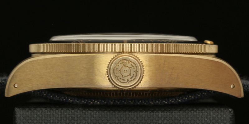 The 2012 Black Bay made use of all the above with the exception of the lollipop hands. Instead, it used what could be considered the next generation of Tudor Submariners, starting with 1969's 7016. This reference was markedly different to any other Submariner-inspired layout as it used square plots and the now (also) iconic "snowflake" hour-hand. This move was not based on some fashion fad, but rather the desire to make a more legible dial in the dark surroundings associated with deep and/or night diving. Another important departure with this generation was Tudor's move from a Rolex 390 in-house movement to sourcing Ebauches SA (now ETA) for movements. I will assume that it was a business move to keep the prices of the Tudor Subs down. For reasons not (yet) clear to me, Tudor also changed their logo from a Rose to a "shield" with this generation, but the 2012 Black Bay displays the original rose logo. 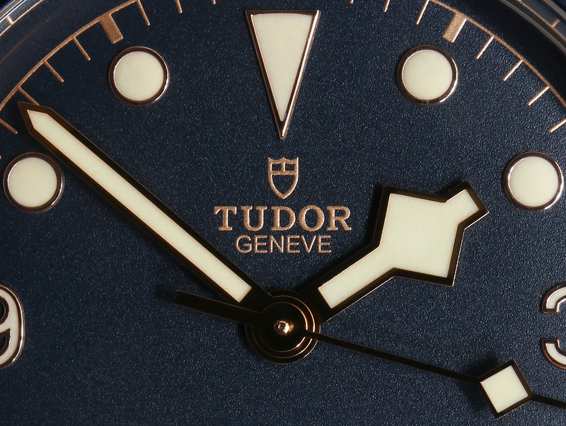 In 2016, Tudor made some noteworthy (and possibly contentious?) updates to the Black Bay, highlighted with the move to their 2015 MT56xx in-house movement, specifically the MT5602. The second big update was to the dial - replacing the 1st Gen Submariner's Rose with the 2nd Gen's Shield and (to my chagrin), went with straight text (also a characteristic of the 2nd Gen Tudors). I do understand the correlation though; just as Tudor replaced the 390 with Ebauches SA in '69, Tudor was now replacing ETA with the MT5602. Once again, ringing in the "new generation" of the Black Bay... ! 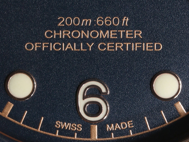 Manufacture Tudor The MT series introduced with the North Flag in 2015 would become great news for the BB series. Despite the excellent workhorse that is ETA's 2824(-2), Tudor's MT provides additional benefits including a modern design with the (silicon) balance spring robustly supported by a bridge, very much like the Rolex's Sub movements. 70hr PR is, imho, a complication in itself and to top it off, Tudor sends out their movements to be certified by the C.O.S.C. The move also plays in with the general direction of non Swatch-Group entities over the past five years or so looking too be less dependent on ETA. The icing on the cake? The cost increase from the 1st gen BB to the 2nd was a matter of ~12% which is quite reasonable considering the massive upgrade. In terms of accuracy, my unit is well within C.O.S.C. specs (-4/+6 in five positions) at +4s/d on average.  image c/o Tudor's official website BB...B! Like all manufactures (including even Rolex as of late), Tudor expanded their product lines with the intent of making "breaking" news at Baselworld et al. 2015 saw the addition of the BB Blue (Blue dial and bezel, silver text) . 2016 brought the "2nd Gen" BB as well as iterations including the "BB Dark" (PVD w/red accents) "BB 36" (polished bezel, ETA 2824) and last but certainly not least, the BB Bronze (BBB). The latter BB not only meant the use of a different case material, but added a whole 2mm the said case's diameter; quite the departure from the now-classic 2012 BB. The BBB had the honor of winning the 2016 GPHG's (Grand Prix d'Horlogerie de Genève) "Petite Aiguille". 2017 continued the practice, introducing the BB Steel (MT5612 - 1st BB with date), BB S&G (two-tone & date), BB 41 and BB Chrono. Getting back to the BBB; While the case material (and diameter) will be the first noticeable difference to the other BBs, the unique dial layout will soon draw your attention as well. Reviewing both generations of Tudors (as well as those issued to the U.S. and French military), I've found no evidence that Tudor ever used Arabic numerals on any of their divers. The dial reminds me of none other than the venerable Rolex 6200 (or original 6150 Explorer for that matter). 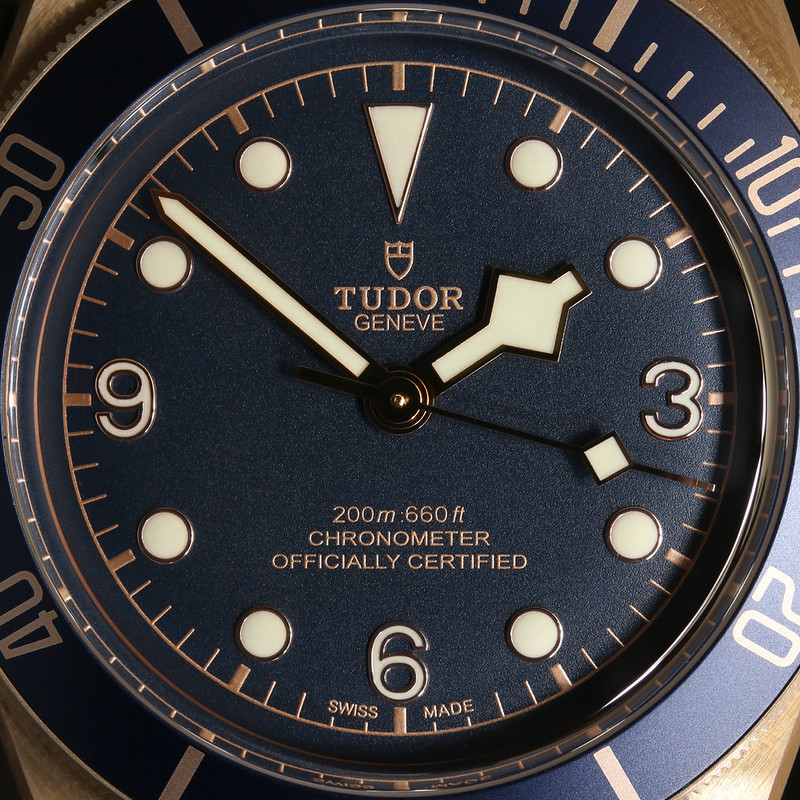 CuAl Although the first (modern) use of bronze in the watch industry is credited to Genta and his 1990's Gefica, I guesstimate the bronze madness really took off only recently with prime examples from Anonimo, Panerai, Ennebi, U-Boat and recently even more "popular" brands like IWC, Zenith etc. According to Tudor's official site, it's "high-performance aluminum bronze alloy"... . I haven't been able to figure out the exact configuration Tudor is using for the BBBs but what's clear is that bronze can be split into several categories including "typical" bronze - CuSn (Copper & Tin), the variation CuSn8 used by Officine Panerai for their venerable 382 (507 & 671) and "Aluminum bronze" CuAl (Copper & Aluminum) which Tudor, among other watch manufactures use. According to one site I arbitrarily came across, Smith Metal: "Aluminum bronze (copper-aluminum alloy) offers the highest strength of the copper based alloys with aluminum being the primary alloying element (typically 5 – 11% aluminum). It is also the most tarnish resistant of all the copper alloys – the appearance of the material does not deteriorate when exposed to the effects of atmospheric corrosion. The alloy offers excellent corrosion resistance in a wide range of environments and is particularly effective in subsea applications. Whilst no engineering alloy can lay claim to being immune from the effects of corrosion, aluminum bronzes naturally form an alumina type protective film which acts as a highly effective barrier." 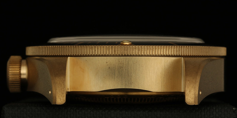 When I look at photos of purposely-induced patina on both types, the results are radically different. Polished, the PAMs have a rose tint which quickly oxidizes to a rust-like dark-red color with potential "accents" in green...; clearly the alloy is very reactive. The CuAl has a yellow tint when polished and oxidizes with a more homogeneous appearance, culminating in a relatively-even medium-brown coating. Personally, if I were to go for a full patina, I'd much rather have the over-the-top look of the PAMs. I find CuAl's patina a bit bland when "complete". I like to go from freshly-polished to streaks of patina but at some point way before the case completely sets, I will restore the finish. Given the above, bronze is not for everyone. It can be a lot of fun to play with, but those of us with some level of OCD can find it at times to be quite frustrating. As mentioned in the preface, all photographs were taken a few weeks after the watch was unwrapped and worn in a normal (albeit hot Summer) environment. I was pleased at the even streaks forming around the case; this gives the case a more aggressive appearance. However there's the odd marring (uneven streaking) caused by direct contact with the surface (like winding the watch) which is less attractive. However most bronze-watch owners are "all in" users and will most likely push the process (through salt water of even sulfur-based methods). For them, there are no "bad" side-effects. I do ask myself what the odds are for these users to potentially promote what's known as "Bronze Disease", something I plan to avoid at all costs ...! 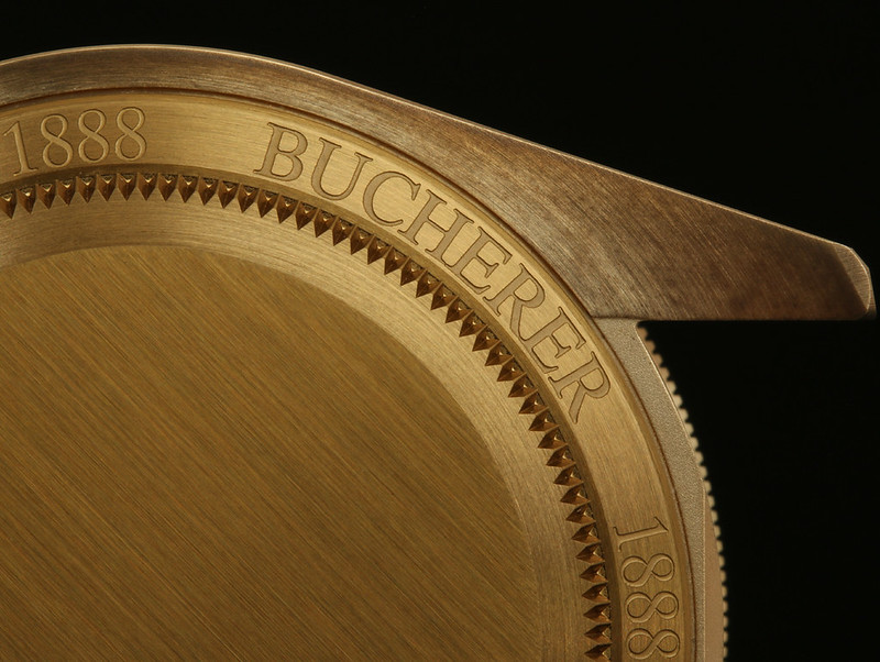 BBB...BB! And now we come to this specific BB, what I've resorted to calling the "5B". NOT part of Tudor's 2017 lineup but rather special (unlimited) edition on behalf of the Swiss-based Watch and Jewelry Group Bucherer, established in Lucerne in 1888. One prominent milestone in the company's history was a partnership with Wilsdorf in the 1920s. By the 1980s Bucherer branched out to several other countries including Austria, Germany, France and Denmark. This Black Bay was commissioned by Bucherer under their "Blue Editions" collection. Tudor follows a few other well-known brands to partake, including AP, JLC and IWC to name a few. 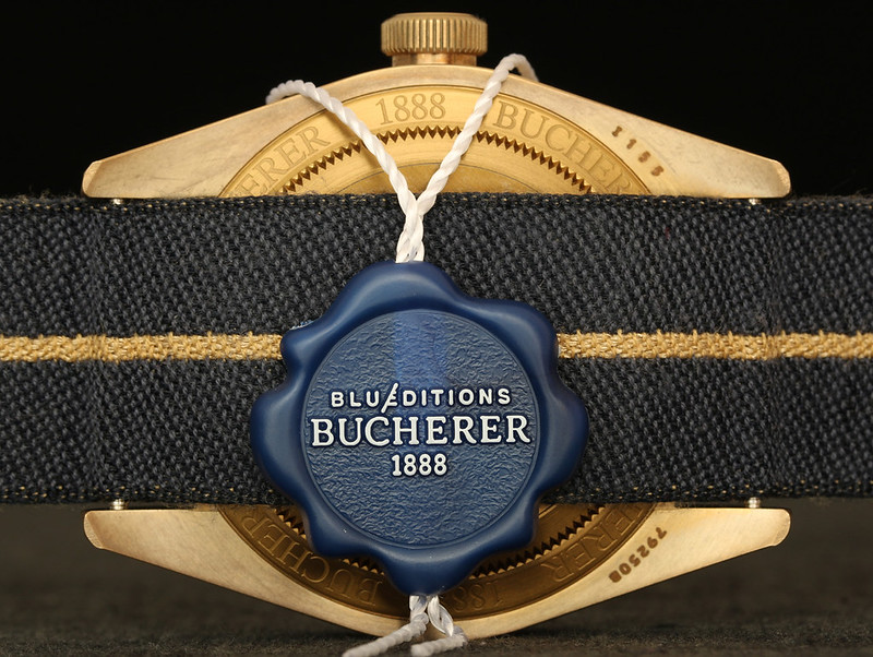 Ironically, I'm not necessarily the biggest fan of blue dials. Knowing that I was into Panerai, Bucherer called me when the Blue Editions PAM came out a year ago. I took at look at it and wasn't really moved. Almost a year later, I passed by the AD to see if they had a Black Bay Black in stock and they showed me the 5B - that combination of Bronze and textured blue dial, along with one of the coolest-looking NATO-like fabric straps I'd ever seen... ! That particular 5B was reserved (and still nicely wrapped in protection) so I put my name down. I figured it would be the better part of a year before getting the call but luck was on my side... ! And without further ado, I present to you the... ...Tudor Heritage Black Bay Bronze Blue - Bucherer Blue Editions 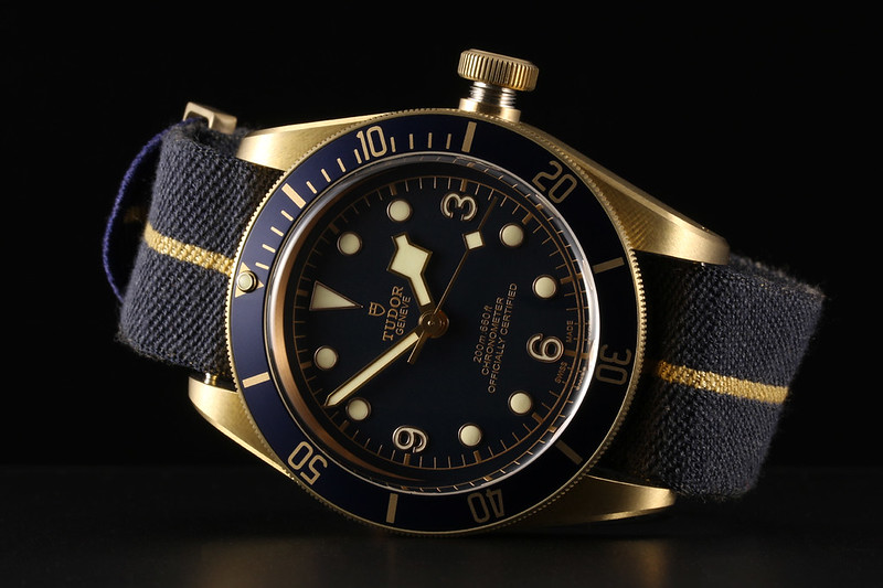 No shortage of options... ...straight out the box. Speaking of the fabric strap; while the fabric is roughly similar in texture, it's not a NATO strap. According to Tudor, it was inspired by the Tudors issued to specialists in the French Navy (Marine nationale) in the late 1970s.. The straps used by the military were actually based on their own parachute material, which had this thin golden-yellow stripe. Tudor's (current) fabric straps are not actually related to such parachuting gear, but rather the results from the french technique of “Jacquard” weaving. I also love the layout of the hardware - a departure from the NATO fittings. One positive aspect the Tudor fabric strap shares with a NATO strap is the added security. If one of the spring bars should somehow fail, the watch will remain on the strap (which is of course still "strapped" to your wrist). 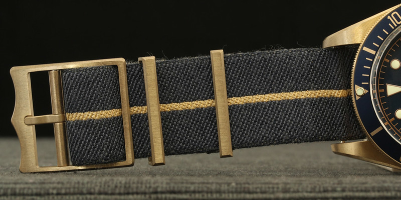 The less positive aspect (imo) is the fact that the spring bars are fed through loops in the strap which means you cannot remove the strap without removing the spring bars... . Perhaps the worst news, for our bigger members; that strap won't make it around anything larger than say, 7 1/2". I have a 6 3/4" wrist and I wear it on the third hole from the tail-end. This leaves just enough tail to fit through the fixed keeper (farthest from the buckle). If I were to go down to the next hole, the tail would not reach the fixed keeper. The silver lining is that the strap can be adjusted to an extent; maybe an additional ~2cm (just under an 1"). Hence, 7 1/2" at best. A real shame given the overall quality of the strap; not being able to use it would be a downer, given how good it looks!!! 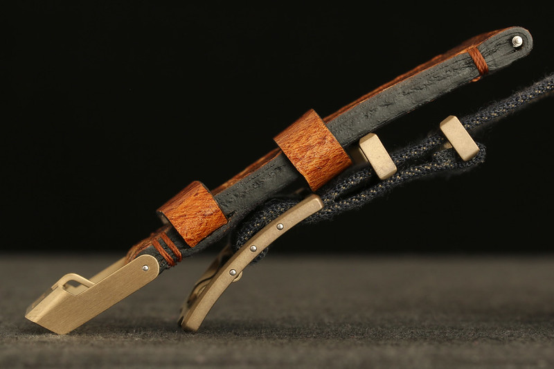 Tudor has also graciously provided a handsome leather strap, also sporting matching bronze HW. While the HW on the leather strap may appear different than the fabric strap's (which currently matches the case's patina perfectly), I haven't used it and it's been properly stored. Thus no oxidation is evident but I am optimistic that it's the very same CuAl alloy. Size-wise, we're looking at 70x130 (23mm, non-tapered). As noted above I haven't actually tried it but I usually use 75 x 125s on my PAMs so I don't think it'll be a problem for anyone except again, in the >7 1/2" range. 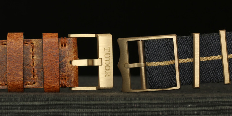 Final Thoughts There's no two ways about it - the color combination is perfect. Navy-blue textured dial, white lume with yellow-gold surrounds, "gilt-ish" text & minute track and matching bezel. Interestingly, they went a bit "rosy" with the rehaut, which reminds me of polished copper. It looks cool though and somehow fits in well. The lume is good, albeit weaker on the arabics due to the minimal surface area. The Jacquard strap works perfectly with the color scheme - so much so that I fear the leather strap my never see the light of day... (well okay, maybe come winter-time). In terms of size, it's a bold piece to be sure. Owning both 44/47mm PAMs as well as 40mm divers, I'm very comfortable with its 43mm & 110g. As noted earlier, the accuracy at +4s/d is excellent, only bested by my five-yr old PAM 233 @+2s/d (and well yeah, by my +1s/wk Spring-Drive GS). As for the "high-performance aluminum bronze alloy", well time will tell. My OCD can creep up on me at times, particularly when those streaks are artificially-induced and uneven. But I think it will be a fun experience and worst case ...I can always reach for the lemon juice! 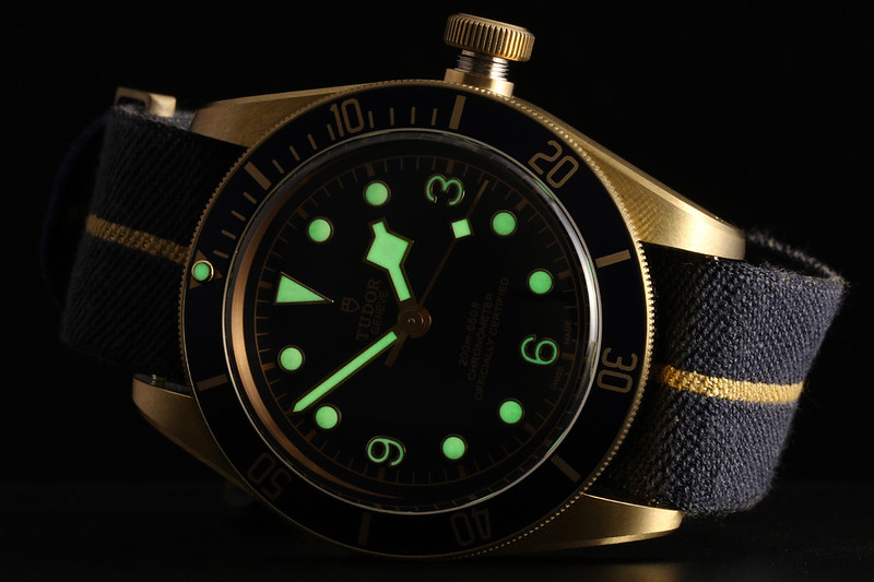  ~~~ The perfect package; 19x14x9cm piano-laquer wooden(?) box! Not a cardboard-like box as with the (Grand) Seikos or last-gen Omegas, yet not over-kill like Panerai SEs which require an own shelf just to store... 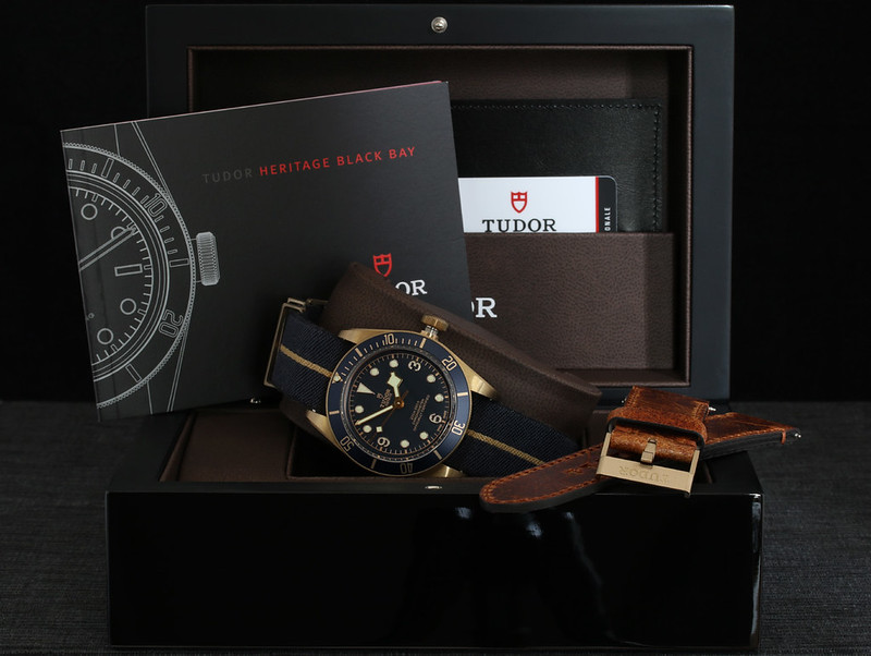 ~~~ Ah, yes - the "big crown" - not only nostalgic but the user's direct connection with the fabulous movement that lies within. Winding and setting are butter smooth... 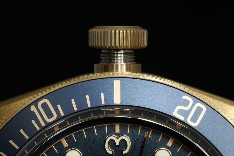 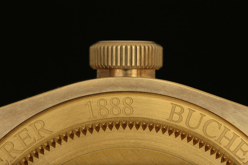 ~~~ case study... a very bold profile yet only .5mm higher than the classic BB...  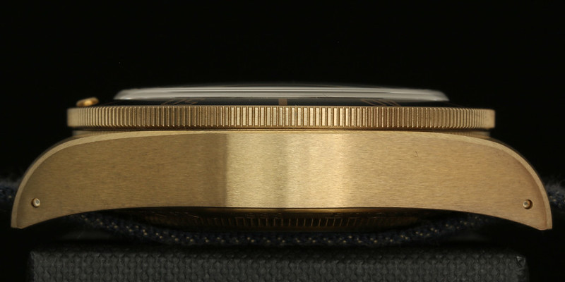   Anodized SS caseback makes it easier on the skin... 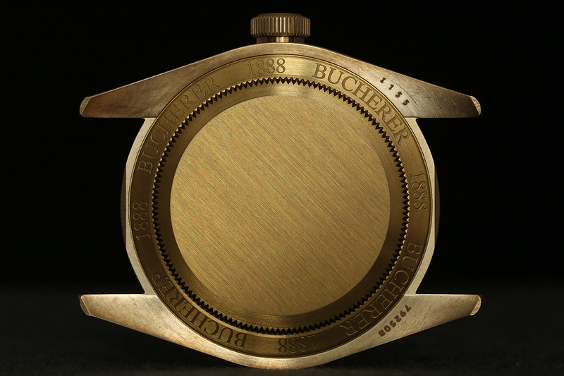 ~~~ Comparison of CuAl cases... 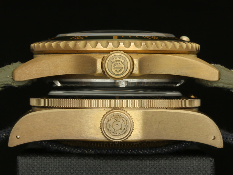 The 15.5mm thick 16600 vs. the 14.5mm BBB... 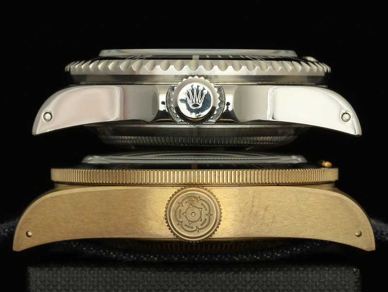 The 43mm BBB appears to tower over the 40mm 16600, but rest assured, it still works on all but the thinnest wrists...! 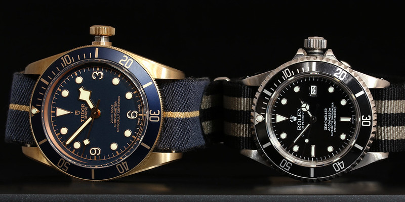 ~~~ Reset! 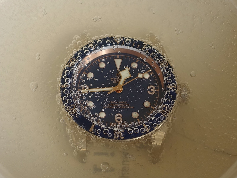 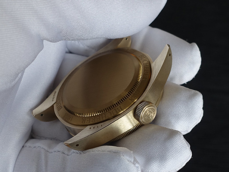 ~~~ P.S. ...did I mention dat blue dial... 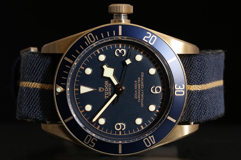
__________________
Traveller - Genève * Melbourne * Miami * Wien Breitling AVI 765r Navitimer 806r Omega 3572.50 SM300MC Speedy Tuesday Caliber 321 Panerai 111 217 233 Rolex 16600 126600 Seiko SBGA125 SBDX001 SLA017 SLA025 SLA033 Tudor 5B GMT Zénith A386ME Other Mühle Glashütte S.A.R. Flieger Chronoswiss Tora Last edited by padi56; 12 August 2017 at 09:49 PM.. |
|
|

|
| Currently Active Users Viewing This Thread: 1 (0 members and 1 guests) | |
|
|
*Banners
Of The Month*
This space is provided to horological resources.