 |
ROLEXROLEXROLEXROLEXROLEXROLEX
 ROLEXROLEXROLEXROLEXROLEXROLEX
|
|
#1 |
|
"TRF" Member
Join Date: Jun 2013
Location: Canada
Posts: 395
|
15400 Royal Oak dials
Lots of opinions shared on the forum lately about the various dials on the Royal Oak. Great discussions. Personally, I struggle with being able to read some dials without my readers on, (sucks getting old).
The new ruthenium just does't do it for me, to my eye it just has no pop, not interesting, no offence to any owners. The blue would be redundant ion my collection plus the surcharge. The black and silver are my two considerations. Both have their benefits, not concerned about opinions as to what is best. For those who have seen both side by side Here is my question - Which colour dial is the most legible? Thx |
|
|

|
|
|
#2 |
|
"TRF" Member
Join Date: Mar 2017
Location: Canada
Watch: Royal Oak Chrono
Posts: 301
|
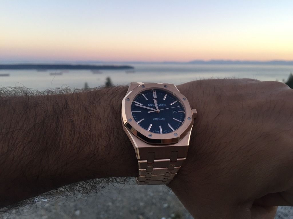
The blue on the rose gold is a very dark blue, unlike the stainless steel 15400. Also, I believe the 2017 models have wider/thicker hour markers for better legibility.
 
|
|
|

|
|
|
#3 |
|
"TRF" Member
Join Date: Apr 2009
Real Name: Yazan
Location: Canada
Posts: 4,782
|
 Sent from my Aster using Tapatalk
__________________
Patek Philippe 5167 Patek Philippe 5905P black dial Rolex Deepsea 116660 M series Rolex Oysterquartz 17000 N series Rolex OP 41MM 124300 Green Dial |
|
|

|
|
|
#4 |
|
"TRF" Member
Join Date: Jun 2013
Location: Canada
Posts: 395
|
Thanks Amiroo I already have the Rose ROC with blue, recent pick up btw.
|
|
|

|
|
|
#5 |
|
"TRF" Member
Join Date: Jun 2013
Location: Canada
Posts: 395
|
Seeking comments from those who have held silver and black side by side as to the legibility
|
|
|

|
|
|
#6 |
|
"TRF" Member
Join Date: Jul 2016
Location: Chicago
Posts: 247
|
I've looked at them side by side at an AD, and found the silver to be easier to read than the black
Sent from my iPad using Tapatalk |
|
|

|
|
|
#7 |
|
"TRF" Member
Join Date: Jun 2013
Location: Canada
Posts: 395
|
|
|
|

|
|
|
#8 |
|
2024 Pledge Member
Join Date: Feb 2010
Real Name: Neil
Location: UK
Watch: ing ships roll in
Posts: 59,369
|
I thought most thought black was more legible as hands had more contrast with the background.
|
|
|

|
|
|
#9 |
|
"TRF" Member
Join Date: Apr 2015
Location: Houston
Posts: 17,622
|
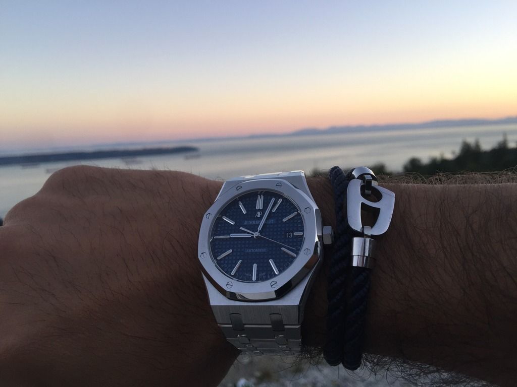
honestly it depends as the WG hands change color with the lighting. So the silver dial is more contrasting when the hands are darker but in those same lighting conditions the black dial would be less legible. Pics for reference... Note the minute hand in pic #2 as the lighting changes toward the end of the hand so you can see the contrast of both the darker hand and the lighter looking hand in the same photo. Natural light, no editing. You can see it as well in the hour markers
|
|
|

|
|
|
#10 |
|
"TRF" Member
Join Date: Jul 2016
Location: Chicago
Posts: 247
|
|
|
|

|
|
|
#11 | |
|
"TRF" Member
Join Date: May 2007
Location: YVR
Watch: PP05196G001
Posts: 55
|
Black dial for me...
Quote:
__________________
Just a few watches here and there 
|
|
|
|

|
 |
| Currently Active Users Viewing This Thread: 1 (0 members and 1 guests) | |
|
|
*Banners
Of The Month*
This space is provided to horological resources.