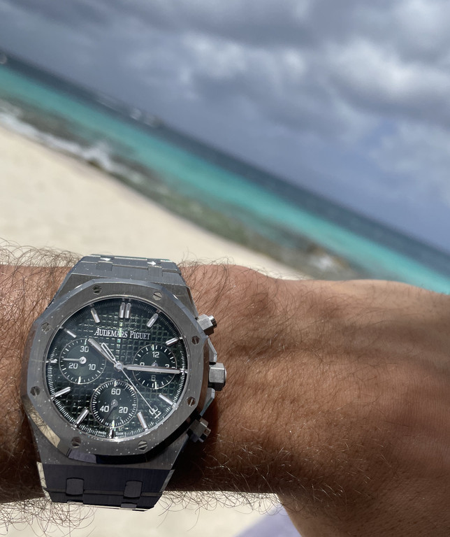
Quote:
Originally Posted by VogelPhoenix

I picked the green dial RO instead of ROC to put on my 50th anniversary "wishlist". But that was dependent on my current collection, which includes the grey dial 15500 and Panda 26331. After trying the 26240 a few times, I still preferred the thinner 26331, but I feel the 15510 is a slight improvement compared to the 15500. The green dial then seemed to provide at least some diversity.
In complete isolation I probably would have a slight preference for the green dial steel ROC vs steel RO, although I feel that pink gold brings the new ROC to a completely different level (more so than for the 26331 and 15500/15510).
Edit: in other words, pretty much what thekman said...
|
Agreed, we are of similar mind regarding these considerations. But your point about the significance of the pink gold case is huge, since I strongly agree that the pink gold ROC minimizes any other little nitpicky ROC concerns! In pictures, I feel the blue dial ROC in pink gold case is much more striking than the green dial, but I havent seen in the metal.
Thanks for your above comments

Quote:
Originally Posted by 7sins

Subjectively speaking with a blantant bias, I prefer the layout of the the dial on the 26240, the 15510 dial optically looks empty and monotonous. Felt the same way about the 15500, the dial made the watch wear bigger than it was and felt cold. The green looks great on the chrono case too, if I wanted a RO case then the jumbo will always be my preference.
 |
No disagreement here. Even with the little tweaks in the recent couple of RO iterations, I do always first think its a little empty; something is missing. Alas, that is what it is. But that point does strongly influence the appeal of the ROC for me. And, especially in steel, I love the green dial. If were discussing the pink gold case, then the blue dial I feel is more appealing. Ultimately, Im curious to see a wrist shot of the green 15510 once someone posts it here.
Thanks for your comments as well.


 ROLEXROLEXROLEXROLEXROLEXROLEX
